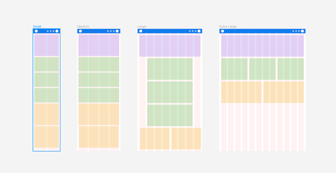
Here’s my reading list for teams and solo designers:
Everything about grids by Thomas Lowry, Designer Advocate at Figma
https://www.figma.com/best-practices/everything-you-need-to-know-about-layout-grids/
🔗 Duplicate this file it’s the example of nested grids example from Tom’s article https://www.figma.com/file/KpGnFzwTnzpu2Z5T4CSFuQ/Layout-Grids?node-id=0%3A1
Here’s an embedded version you can explore
Create layout grids using frames or nest frames (hint they help auto layout settings when using grids)
https://help.figma.com/hc/en-us/articles/360040450513-Create-layout-grids-with-grids-columns-and-rows
Additional articles
Figma: How to build responsive and scalable grids for web-design
https://bootcamp.uxdesign.cc/figma-how-to-build-responsive-and-scalable-grids-for-web-design-9dd80a1e3668
Responsive layout grid guide for designers (part 1 is referenced, this is part 2 though)
https://uxdesign.cc/responsive-layout-grid-guide-for-designers-c3ba7d161bdf
Everything you need to know as a UI designer about spacing & layout grids
https://medium.com/design-with-figma/everything-you-need-to-know-as-a-ui-designer-about-spacing-layout-grids-2bc269e12321
Responsive grids and how to actually use them
https://uxdesign.cc/responsive-grids-and-how-to-actually-use-them-970de4c16e01
The Comprehensive 8pt Grid Guide
Start your UI project right with this extended framework for the 8pt grid: Typography, Icons and Layout. Part 1
https://medium.com/swlh/the-comprehensive-8pt-grid-guide-aa16ff402179
Design System based on the 8pt Grid
This article is the 2nd in a two part series
https://medium.com/swlh/design-system-based-on-the-8pt-grid-2473ca5f0ae1